Showing posts with label Music Magazine- Front Cover. Show all posts

Friday, 16 January 2015

The Best Photo and Photoshop Changing

i have chosen that this photo is the most successful from my third photo shoot and therefore i will be using this for my final front cover. i chose this because i think it is much more interesting and a more exciting expression is shown. i like that she is using her hand to pose which i think makes the positioning quite cheesy which suits the magazine. i also like that there isn't any harsh shadows such as on the wall which were very visible in my other photo shoots. also this photo has enough space above her head and besides her, to enable me to write and apply the title and photos.


to edit the photo for the front cover i used Adobe Photoshop, i firstly removed the background by using the eraser tool which allowed me to create a transparent background and also get rid of the fly away hair on the top of her head. also i used the clone stamp tool which allowed any blemishes that i didn't want on the photo to disappear, such as the freckles and marks on her arms. also i used this tool for underneath her eyes to get rid of some of the crease to open her eyes more. i noticed on her arm and on her top that some strands of hair were there so i used the clone stamp tool also to blend the top and hair slightly so that it was less visible.

Tuesday, 6 January 2015

My Third PhotoShoot

for my third photoshoot i took photos of my friend again, but changing her clothes so that they are more suitbale. for her clothes i put her in a plain short white top. however to make this more interesting i chose the top that had some detailing around the neck. this made it look like she was wearing a necklace. i also changed her hair by curling so that it was slightly wave, i like the affect that this gave as the waves followed the edge of her face. i looked at different positioning, for example getting her to use her hands more and changing her perspective by getting her to turn to the side slightly. the lighting i used was artificial but i stood her more further away from the wall so that her hadow was not that obvious and also the lihting did not make her too shin. i did he makeup simiar to the last photoshoot by highlighting her dark areas and brightening her eyes using concealer and lightly cloured eyeshadow.

Thursday, 1 January 2015

My FrontCover

This is my front cover for my music magazine, i am quite happy with this as i think i have improved a lot. i like the colours that i have used and also the different fonts. however i think it could be better, such as the clipping path around the photos and images i have used.

Proof Of Indesign Front Cover


For the nail varnish and other objects and photos on the page, i used photoshop to remove the background. i did this by using the eraser tool which allowed me to erase the background colour. Also after i did this i used the clipping path of Indesign which make the removal of the background more accurate.

Drawings


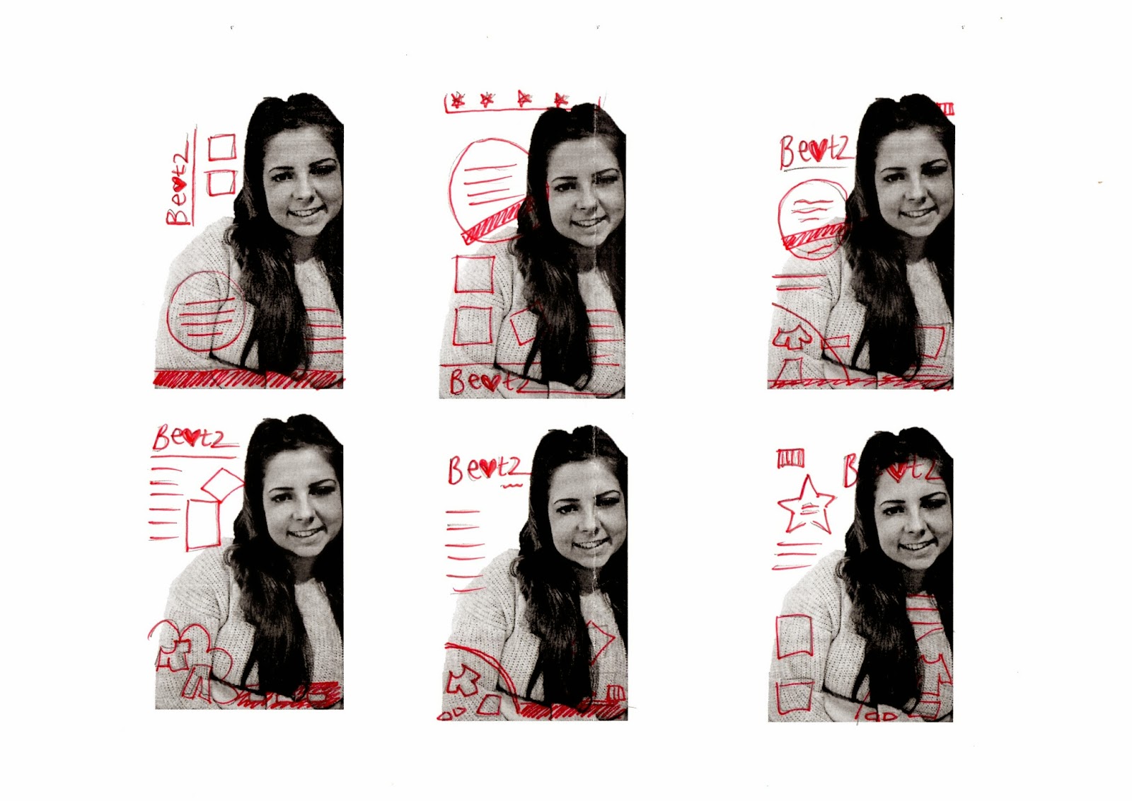
 to plan out my front cover i did some drawings and then scanned them in. i firstly used a photo from my second photoshoot as rough template of what my magazine will look like, (i will not be using this photo for my final draft). i drew out some of my ideas onto the 6 photos, i then looked at the ideas and features that i liked about each drawing. finally i drew out four possible front covers by using features that i liked from the other drawings. all of these drawings have a similar layout, which is the route that id like to go down. i like having the main title 'beatz' in the top left hand corner and having a clothes section at the bottom. i would like my magazine to include a photo and also a barcode either at the top or bottom corner. the drawing that i like the most and will be using to plan my front cover is the third drawing, displayed above.

Friday, 5 December 2014

Second Photoshoot

For my second photoshoot i decided to change the appearence of my model slightly by relating to the research i did after my first photoshoot. i used more  natural makeup and light eye shadow and highlighter to brighten her face. i also used blusher to make her cheeks more prominant. by looking at the ariana research i got my model to wear a cream jumper. i did similar poses as my last photo shoot but changed the way i shot the photos, by thinking about the lighting and the way she looked.

Thursday, 20 November 2014

Photo Shoot 1 (Best Photographs)

I have chosen my three successful photogrpahs out of my first photoshoot. i have decided to choose the first one as i think she is positioned nicely and the photo is is at a good quality. however i think that her coat looks too scruffy for the type of magazine that im doing, i also think that the photo is too up close and there will not be enough space for any writing, the title or photos. the second one is better i think tas the lighting is better as it brightens her eys which makes her look younger. How her hair falls around her face also makes the photo look better as it makes her look more elegant. however her hair is slightly messy and would need quite a lot of work in photoshop. also the hair band on her wrist is distracting and it also does not look proferssional. i like the lighting on the last photogrpah as it is very bright which makes her features stand out such as her eyes. howver although the lighting is bright, the skin and area around her eyes is quite dark which makes her look older and less innocent. i think th elighting also brings her best feature out 'her cheeks' as i have also taken the photo from a higher angle. to conclude i think these photogrpahs were the most successful in my first photoshoot but i dont think t hey are strong enough to use for my final music magazine front cover, therefore i will be taking another set of photos to produce a good quality magazine cover.

First Photoshoot

For my first set of photographs i took photos of my friend. for her clothing i got her to wear a pale blue coat so that the colour did not overpower the writing on the front page. however after i took the photos i realised that the clothing did not look as neat as i thought. i also made her hair and makeup quite natural by having her hair down or some of it pinned back. for her makeup she had little foundation and eyelashes with mascaerer, becasue of the lack of brightening her face i hasve decided next time to use highlighter to make her cheeks stand out and also to brighten her face around her eyes. i also need to think about other disadvantages of the photos such as the hair band around her wrist and any stray hairs. i used artifical lighting for this photoshoot as i thought it would be best. to achieve these photographs i researched the photos that were on current magazines of the same genrre. i then took photos using the same positions as the models.

My Font Research


i firstly began with finding some fonts that i preferred and the ones that i thhought would be good for my magazine. out of those i found a font that was my favourite, i then experimented by changing it slightly by stretching, having caps lock, spacing the letters or making the letters italic. next i started looking at the colouring of the font, i decide that i liked the pink and more girly colours as it suits my magaizne best. lastly i developed the font by making it look more unique by adding shapes such as th hearts and stars.i also looked at making the colouring look more metalic. howver i like the fonn that i have chosen as it is simple but still has an interesting look an responds to my magaizne title research.

My Magazine Titles& Final Decision

To decide my music magazine titles, i researched differnt names of current magazines to give me an idea of what was avaliable. After doing my research i was aware that some titles includeed shapes such as hearts and circles or had a unique letter. i have decided to call my music magazine 'Beatz'as i think it sounds the most appropriate for my magazine. i have also decided that the 'a' in the title will be a heart and the 'z' will be the unique letter.

Magazine Font Research


Sunday, 16 November 2014

Music Magazine Research


Target Market&Genre
My genre that I have chosen to do for my magazine is POP. The reason that I have chosen this is because I think it is the genre that I listen to the most and it is very popular with people my age also. Therefore I can relate to it more and it will be easier to respond to my research. I have decided that my target audience is going to be aimed at teenagers between the ages of 12-16. I think this is the best age gap as people will be going through similar phases. Therefore it will be easier to choose what content I would put in the magazine because they are a similar age. There is not a particular gender for the magazine to be pointed at as I think it can be read by either. However I think it will be more popular with teenage girls; this is because they can become quite obsessive with their role models and people they like such as boy bands and male singers. There are usually two types of teenage girls, which are obsessive fans and people who just enjoy the music. I think I have aimed the magazine towards the obsessive fans because they would enjoy it more as it would contain information and photos that they would want to know, such as interviews. On the other hand boys can also read the magazine, but it will be less popular with them. I think it will apply more to the more feminine boys who enjoy reading and looking at girly things. The magazines that I have looked at such as ‘top of the pops’ and ‘bliss’ also have a similar target audience so by doing my research I know how to respond correctly and make my target market happy. My target market like POP music artists such as cheesy music acts who are very popular such One Direction, Union J, Arian Grande and Justin Bieber, these types of musicians will gives me inspiration for my music magazine.