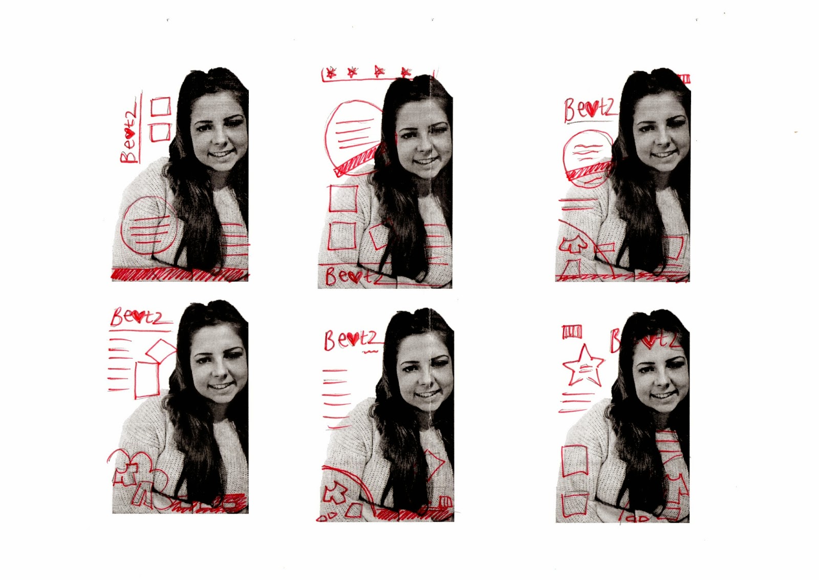
To plan my contents page i drew out 4 different layouts that i could use, or change to make my own page. From doing my research i learnt that the most common part of the page was that it contained a picture of the front cover, so i drew one on every page along with a page title of 'contents'. I also want to have some photos either down the right hand side of the page or at the bottom, which responds to my research. I thought about having writing on the page which will be a paragraph written by me telling readers about the magazine. I also thought about having page numbers with a description in a box shape.
After looking at my drawings i put my favourite features of the different layouts together to create this drawing. Ive decided to keep the title quite simple and san serif, also with 3 dots after the title to show that te magazine is carrying on. I want to have the photo of the front cover over to the left hand side of the contents page with curved arrows coming off with page numbers. Also i have drawn out to have a paragraph of writing informing readers about the magazine and a square of information and page numbers on the right. In the bottom right hand corner i have drawn the magazine logo along with the email or website so readers can get in contact.


